DDW launches new website
On Monday, October 16th, the Durham Democratic Women launched their new website with an increased focus on member utility, recruitment, and voter engagement. The new website is clear and easy to navigate, making learning about and joining the organization easier than ever before.
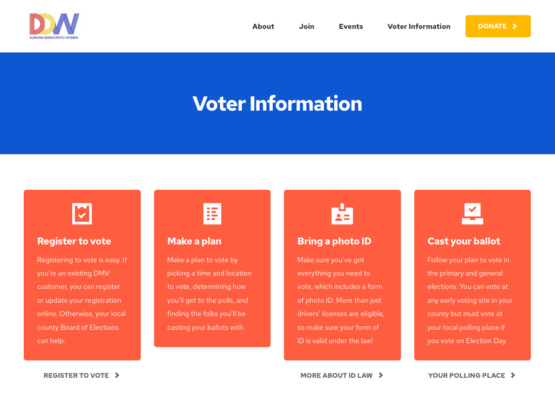
Bright colors and clean lines help focus website users to important areas of interaction and focus. On the Voter Information page, the most important items are the short calls to action with supporting information written beneath, aided with a link below each box to keep the area clear and easy to read.

Using new ideas in web design like "mega menus," users are able to get to important information more quickly without having to parse dense pages and subpages to find what really matters. When there's only two steps to joining this organization, DDW made helping users find and follow through with those steps the priority in the design.

